HomeLab

LabBehind the site

How this site gets made, round by round.

I direct this site and Claude writes the code. Every change to how a page looks or reads goes through the same loop: a brief, a mockup I approve, a build, checks, then a deploy I sign off. Fixes skip the mockup but still need my OK to deploy. Below are twelve rounds from October 2026, with what changed and why.

Designed and built with help from AI tools (Claude), with every number checked against its primary source.

01How it is made

Who does what, and how a change ships.

Roles

Me
Direction, product decisions, design approvals, the rules, and the final OK on every deploy. I supply and confirm the facts that every claim about me is checked against.
Claude
Writes the code, drafts the copy and the mockups, and runs the checks.
Fact-check
A second Claude agent that checks new claims about me against that facts file before they ship.
The loop

  1. BriefWhat to change and why, with the rules that apply.
  2. MockupA private page to review, on a phone and a laptop, in both themes.
  3. ApprovalI approve it, ask for changes, or say no.
  4. BuildClaude ports the approved mockup into the site.
  5. ChecksEvery page at four widths and in both themes, plus accessibility, security and fact checks.
  6. DeployOnly with my OK. Then the live files are checked byte for byte against the build.

Budgets every release is held to

  • 0accessibility violations (axe), and 100 for accessibility in Lighthouse on the pages measured
  • 0console errors on live pages
  • 0sideways scroll on a phone
  • SpeedLighthouse on a phone for every new page before it ships
  • Headersa security policy on every page, with every inline script that runs listed by its hash

02The rounds

Twelve rounds, oldest first.

Each one shows what changed, why, and who made the call. Where a round set a rule the site still follows, it is listed.

  1. DesignMy call

    One look for every page

    What changed
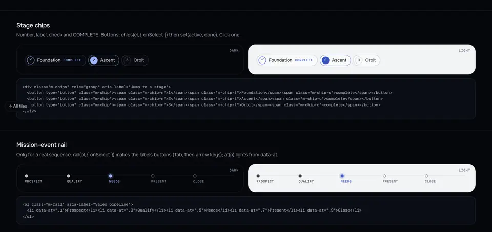
    After Home and Skills were approved, the other pages were rebuilt on one shared kit: label chips, a timeline rail, rulers in real units, and glass cards joined to the picture by thin lines.
    Why
    I asked for the rest of the site to take its cues from Home and Skills, so the pages feel like one site.
    Rule it set
    One main visual per page. Never two showpieces on the same page. One accent color at a time.
    The shared kit page: label chips and a timeline rail, each shown in the dark and light themes.
    The shared kit, dark and light.
  2. DesignMy report

    Phones lose the bottom tab bar

    What changed
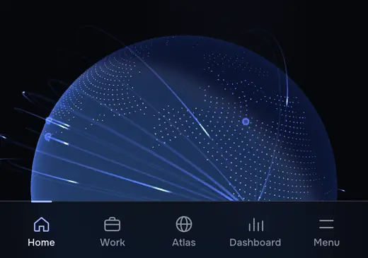
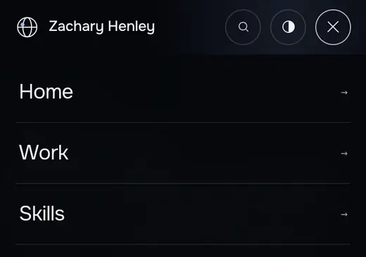
    The tab bar at the bottom of phone screens was removed. The header Menu now opens a full-height sheet.
    Why
    I reported that the bar felt finicky on my phone, then that it floated when Safari's toolbar collapsed. Claude traced it to iOS 26 Safari, which does not draw fixed content where its collapsing toolbar was, so I chose a top header only.
    Before: the Home page on a phone with a tab bar along the bottom.Before
    After: the phone Menu open as a full-height sheet listing the pages.After
    Home on a phone, before and after.
  3. BusinessRecruiter-style review

    A recruiter's-eye read of every page

    What changed
    Claude reviewed all 29 pages the way a recruiter would. The business is now called affiliate in each hero, the counts agree from page to page, Home shows the case studies before the 3D "How I work" section, the Dashboard leads with one finding, and the resume PDF is one page that applicant tracking systems can read.
    Why
    The review found wording that could read as inflated and counts that disagreed. I approved its fixes.
    Rule it set
    Name things the same way everywhere, in the facts file's words.

    Home intro

    BeforeI built my own e-commerce business from zero on SQL and Python, managed a $2M marketplace portfolio across Amazon, Shopify and Houzz.

    AfterI built my own affiliate e-commerce business, a product-recommendation site, from zero on SQL and Python, managed a $2,000,000 product portfolio across Amazon, Shopify and Houzz.

    Wording from the live Home page, before and after (excerpt).
  4. DesignMy call

    A quieter light theme

    What changed
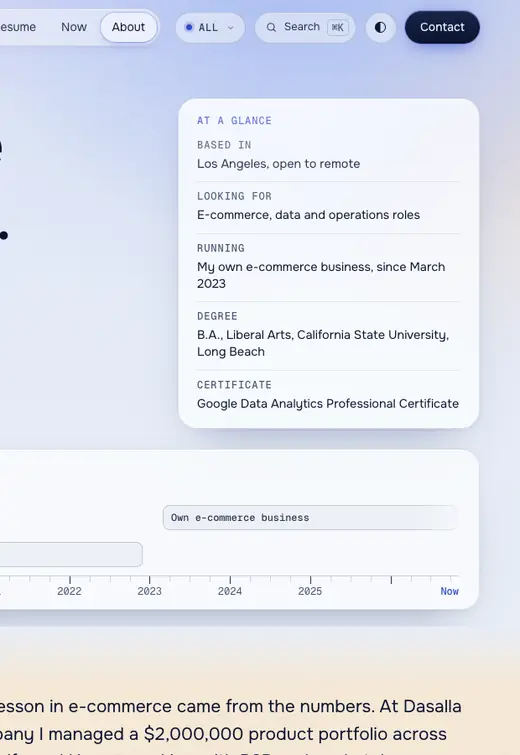
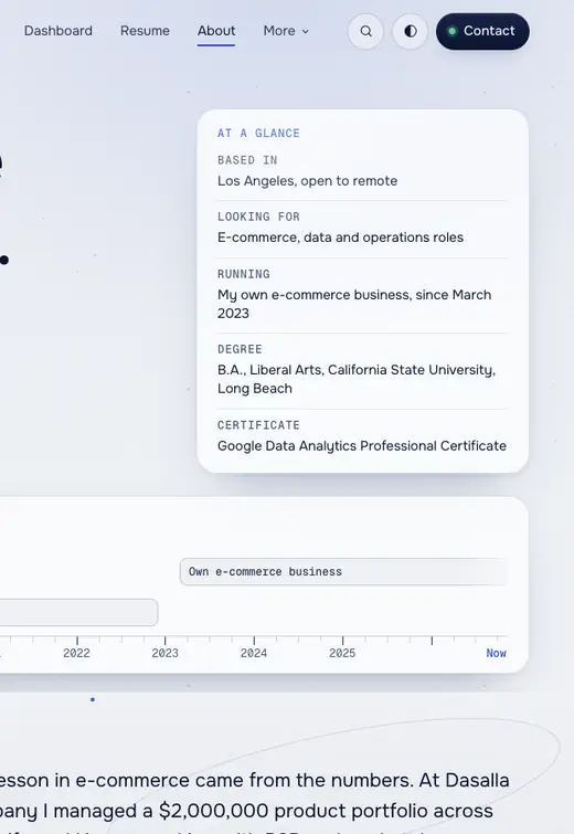
    The light theme went from tinted bands and soft blue glows to one cool neutral family. The glow that followed the cursor was removed.
    Why
    I found the light theme too colorful and asked for the cursor glow to go.
    Rule it set
    No cursor glow.
    Before: the About page in the light theme with a lavender tint behind the header and the at-a-glance card.Before
    After: the same part of the About page on a plain cool grey.After
    About in the light theme, before and after.
  5. DesignMy call

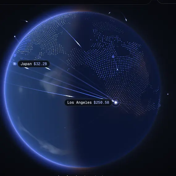
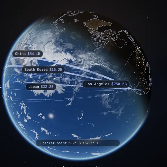
    From a dot globe to a real Earth

    What changed
    The home globe went from a field of dots to NASA imagery of Earth, with hairline coastlines, a realistic edge between day and night, city lights and clouds. On the Atlas, the mouse wheel zooms the map only after you click it.
    Why
    I reviewed the second demo and asked for no dots and a more realistic edge between day and night. I left the open questions to Claude, which made the Atlas zoom only after a click. The third version shipped.
    Before: the home globe drawn as a field of blue dots with trade arcs to Los Angeles.Before
    After: the home globe as a photographic Earth with clouds, coastlines and trade arcs to Los Angeles.After
    The home globe, before and after.
  6. DesignMy call

    The rocket, three versions in a day

    What changed
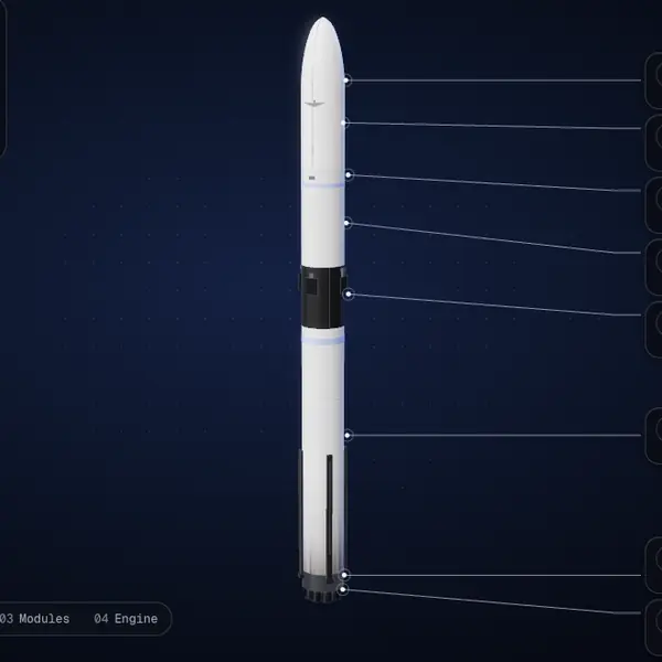
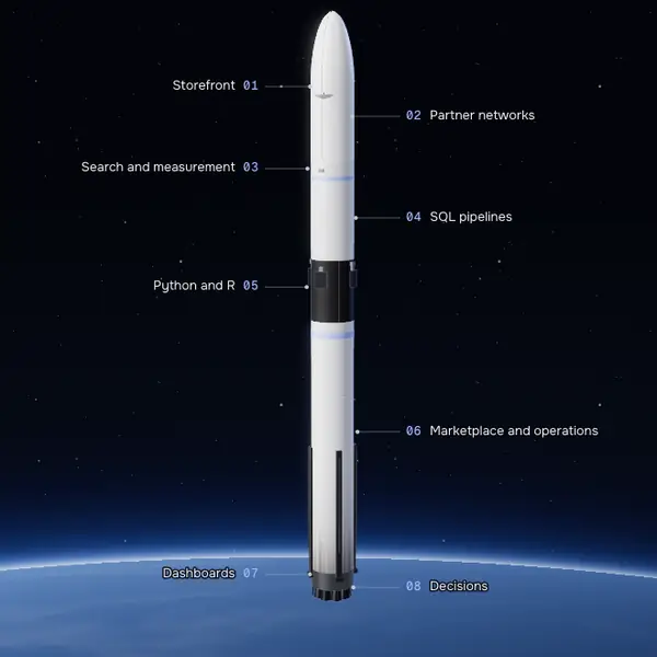
    The Home rocket became one continuous camera move from nose to engine, set against Earth from orbit, with a card for each module.
    Why
    I chose one descent with no second pass. An orbit backdrop and a launch-pad backdrop were both built so I could compare them, and I picked orbit. I also asked for the particle stream along the rocket to go.
    Version 1: the rocket on a plain dark blue background with leader lines to cards off to the right.Version 1
    Version 3: the rocket against a starry sky with numbered module labels on both sides.Version 3
    The Home rocket, first and third versions.
  7. DesignMy call

    The solar system: sketches first

    What changed
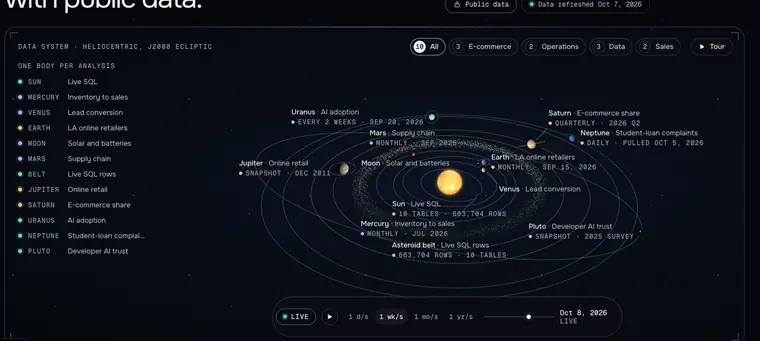
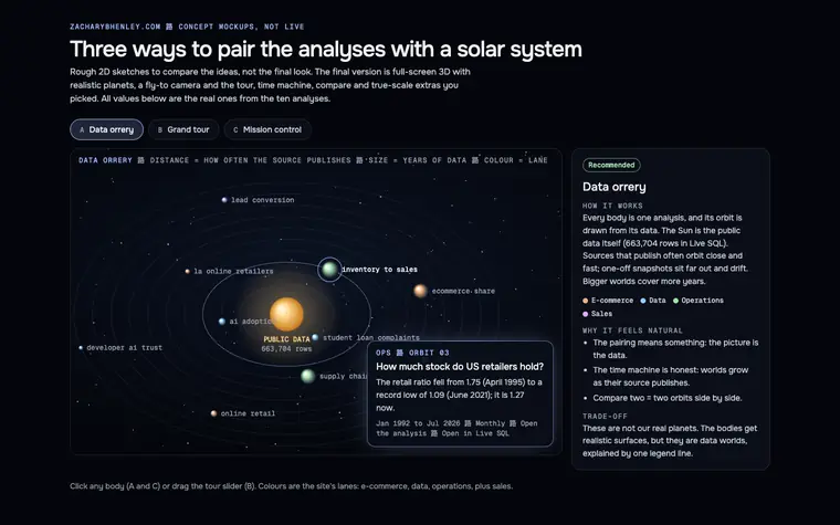
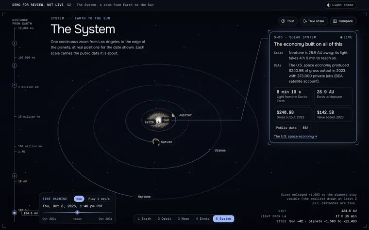
    The first solar system was a demo for the top of the Dashboard, with one analysis on each planet. Three quick 2D sketches came next. The version that shipped is its own page, The System, which opens on the home globe and zooms out past the Moon and the planets to the Sun.
    Why
    I found pairing a planet with each analysis unnatural, and asked for a simple mockup of each idea before choosing. After the sketches I chose a page of its own, with the data paired by scale.
    The rule behind it
    Every visual change is approved as a mockup before it ships.
    First try: a demo orrery for the Dashboard, each planet labeled with an analysis.First try
    The sketch page: three ways to pair the analyses with a solar system, data orrery, grand tour and mission control.Sketches
    Shipped: The System page, zoomed out to the planets' orbits, with a distance ruler down the left side.Shipped
    Three steps: the first try, the sketches, and The System.
  8. ChecksMy report

    Checks that look at the page

    What changed
    A menu class name clashed with the one the 3D pages use for their scroll mode, so two pages showed nothing on wide screens. The class was renamed, and a blank-page test was added to the automatic checks.
    Why
    I reported the blank pages. The checks had looked for errors, accessibility problems and overflow, but not whether anything was visible.
    Rule it set
    Every check run confirms that each page actually shows its content.
    1. On wide screens, Skills and the parcel journey rendered blank. Fixed the same morning.

    2. On Sources, one row's tag list never closed, so 19 rows sat inside it. Found during a Claude review; fixed, and all 60 rows were then checked with an HTML parser.

    Two bugs the automatic checks did not catch.
  9. ChecksMy call

    Security headers, D to A+

    What changed
    The site now sends strict security headers: a policy that lists every inline script that runs by its hash, HTTPS only, and no framing by other sites. The domain's email records now block spoofing, visits are counted without cookies, and the visit counter's script is now served from the site itself.
    Why
    I asked for a security pass, with the policy enforced only after local tests passed. Later, a GPU texture format (KTX2) was turned down: WebP was smaller at the same quality, and KTX2 would have needed the policy loosened.
    Rule it set
    No security policy violations on any page before a deploy.
    Mozilla Observatory, the live site, Oct 7 and Oct 8.
  10. BusinessMy call

    Business first

    What changed
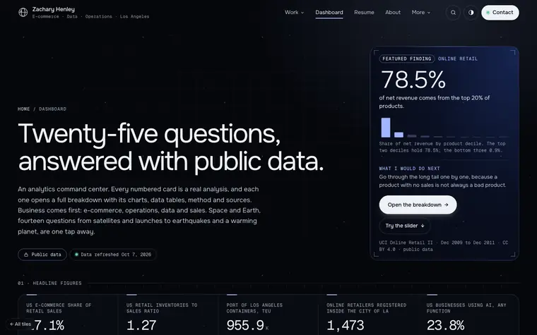
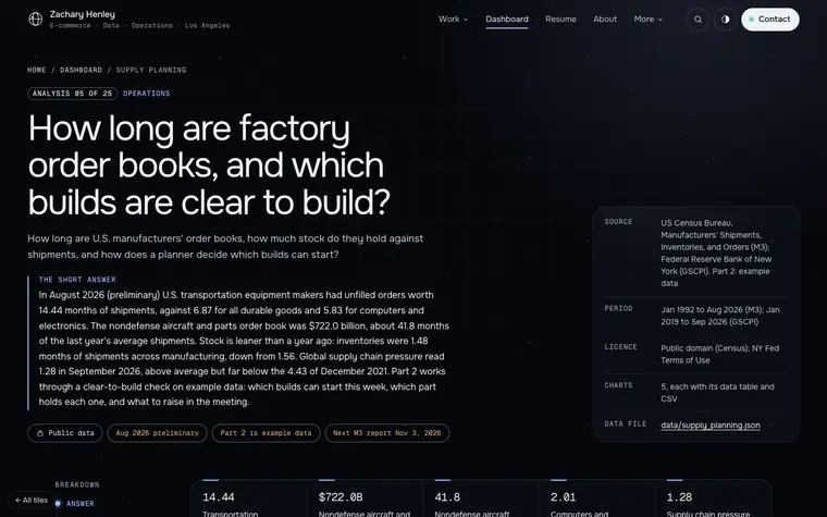
    The Dashboard now opens on the business analyses (e-commerce, operations, data and sales) with one featured finding on top, and Space and Earth a tap away. A new supply-planning analysis reads U.S. Census data on factory order books, then works a clear-to-build example on labeled example data.
    Why
    I approved leading with the business work. Later that day I asked that the site not tilt toward space: new space ideas go inside The System, not onto new pages.
    Rule it set
    No new menu items for space.
    The Dashboard opening on Business, with a featured finding card: 78.5% of net revenue comes from the top 20% of products.Dashboard
    The supply-planning analysis page: how long are factory order books, and which builds are clear to build?Supply planning
    The Dashboard and the new supply-planning analysis.
  11. BusinessFact-check

    Review timing, measured right

    What changed
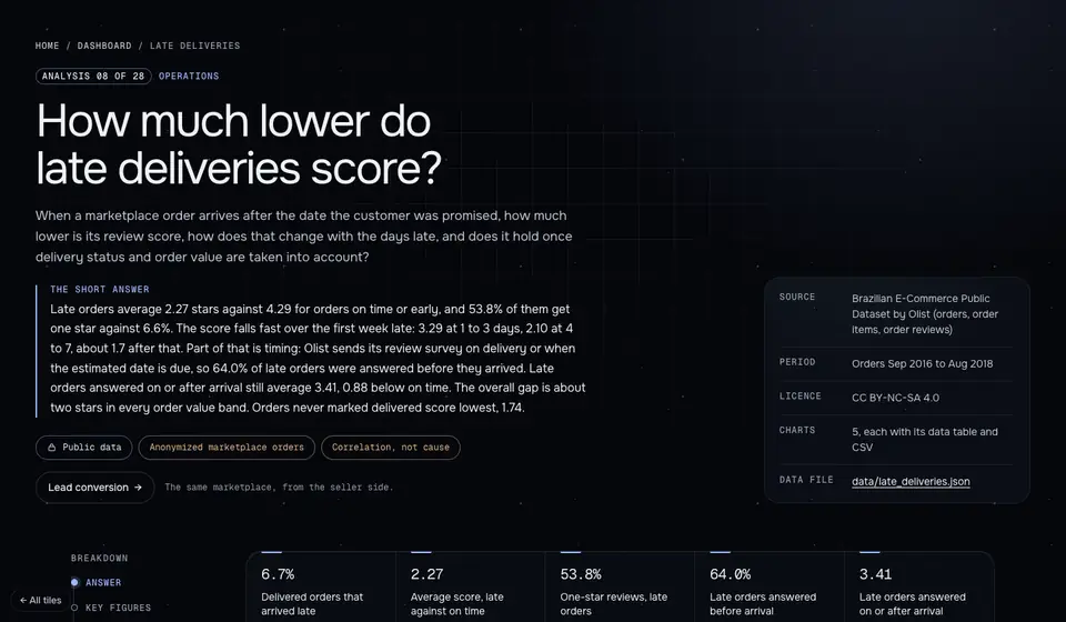
    Before the Late deliveries analysis shipped, the fact-check flagged how reviews were timed. The page now times each review by when the customer answered it. It keeps the overall gap (2.27 stars late against 4.29 on time or early) apart from the more cautious gap for reviews answered on or after arrival (3.41 against 4.29).
    Why
    The fact-check flagged the review timing as a high-priority fix. Timed by when each customer answered, 64.0% of late orders were answered before they arrived, so the page reports both gaps.
    The Late deliveries analysis page: how much lower do late deliveries score?
    Late deliveries, on public Olist data.
  12. ChecksFact-check

    One word too many

    What changed
    A line on the For operations page said the opportunities were kept accurate. It now says only what the record supports.
    Why
    The fact-check flagged "accurate": the facts file doesn't say it about this job.
    Rule it set
    Claims about me come from one facts file and pass a fact-check before they ship.

    For operations, Green Solar card

    Before100+ active opportunities kept accurate in Velocify and a weekly report to leadership on outreach, conversion rates and revenue.

    AfterKept 100+ active opportunities in Velocify CRM, with a weekly report to leadership on outreach, conversion rates and revenue.

    The sentence, before and after.

03Contact

Want the story behind a round? Ask me.

Open to e-commerce, data and operations roles. Los Angeles or remote.